While implementing dark mode for this blog, I found that images and videos seemed a little too bright when set against a dark background:
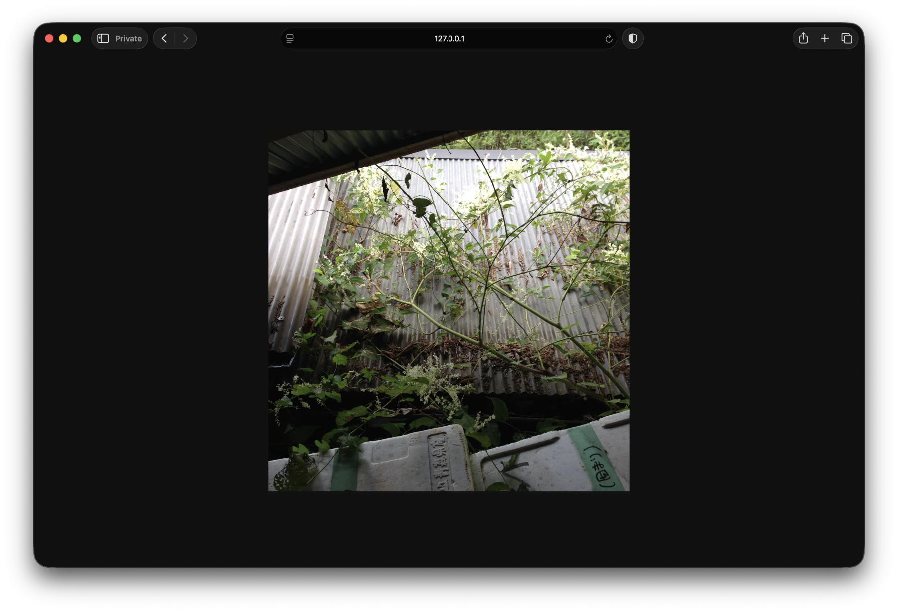
It felt like I was being flash-banged every time I scrolled past an image/video, so I added a CSS rule to darken all media in dark mode:
@media (prefers-color-scheme: dark) {
    img, video {
        filter: brightness(0.75);
    }
}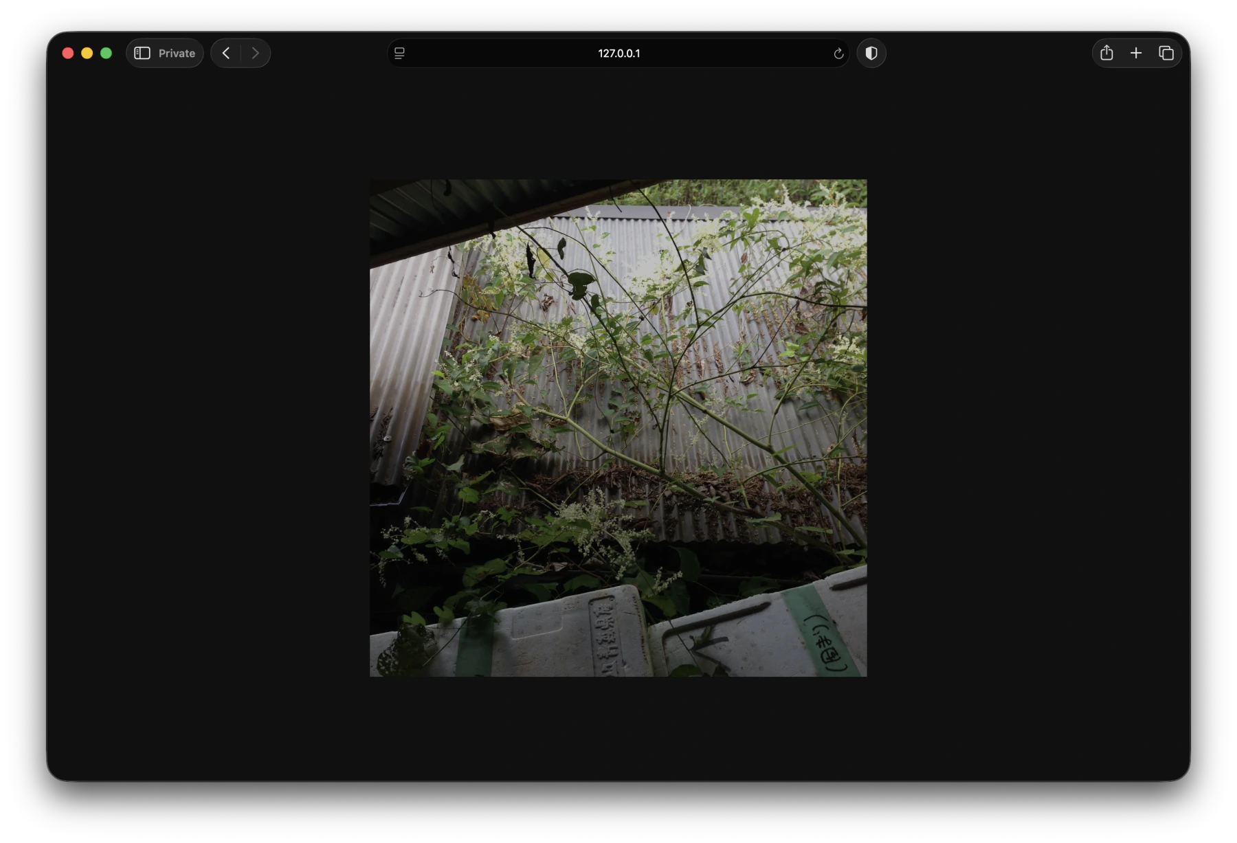
This already feels much easier on the eyes, but the image appears more cloudy and there seems to be less contrast than before 1. To compensate for this, I boosted contrast and saturate a little:
img, video {
    filter: brightness(0.75) contrast(1.05) saturate(1.05);
}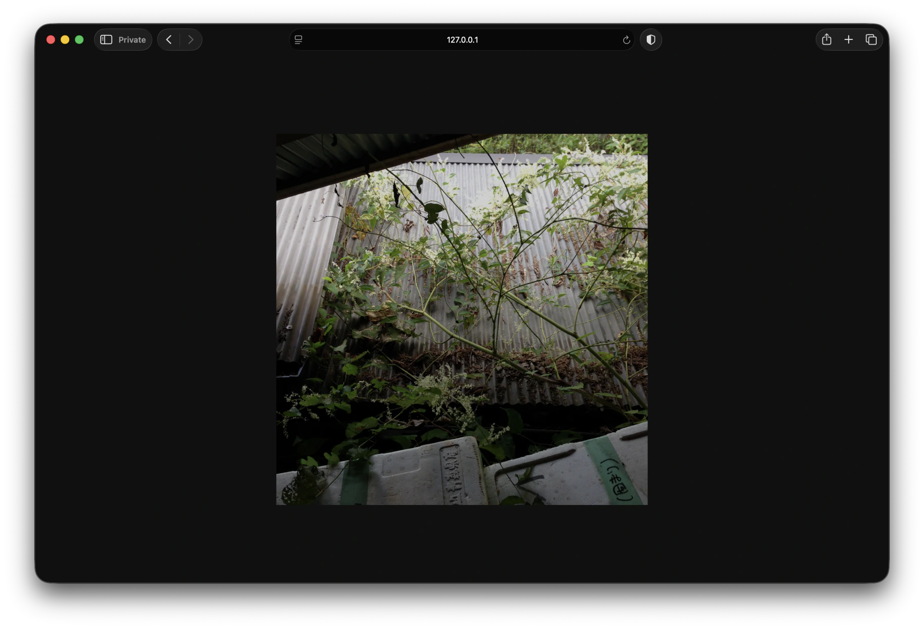
And that seems to restore some of the original fidelity of the image. It's such a minor adjustment but it makes a noticeable difference, to my eyes at least. Here's a (hopefully) clearer side-by-side comparison (note the greens and browns of the leaves on the sheet metal roof):
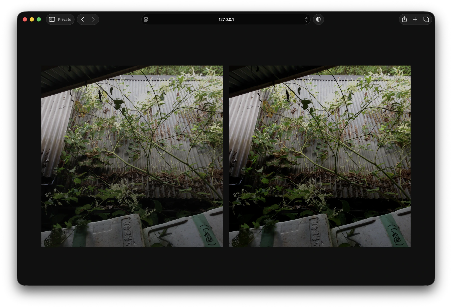
...and compared to the original:
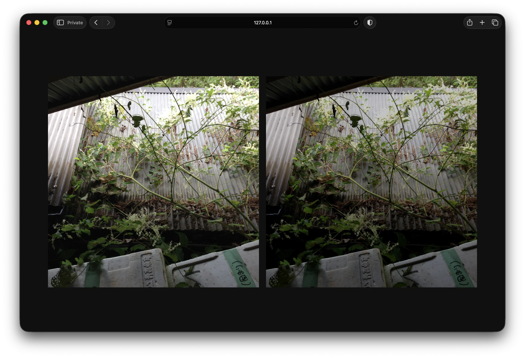
I just eye-balled the contrast and saturate values since I don't need to display anything super accurately on this blog. Now I and anyone else can happily scroll in the dark and everything should remain the same relative brightness.
I don't really know much about colors, but I think it's due to the fact that brightness() is a straightforward multiplier on linear RGB channels. So the difference between neighboring colors becomes smaller, and our eyes already naturally perceive darker colors as less vibrant, leading to muddier images/videos when just brightness(0.75) is applied.