It's pretty straightforward to support light and dark mode in an iOS app with UIUserInterfaceStyle. With a simple dropdown menu in some settings page with System, Light, and Dark options, we can easily switch the preferred theme with something like:
func changeTheme(_ style: UIUserInterfaceStyle) {
    // Either .unspecified (system), .light, .dark
    window.overrideUserInterfaceStyle = style

    // Save preference to UserDefaults
    // so correct theme is applied on startup
    //
    UserDefaults.standard.set(
        style.rawValue,
        forKey: "com.myApp.themeKey"
    )
}
Then, when the app launches, in SceneDelegate.swift, we can apply the selected theme as follows:
// Read saved theme preference from UserDefaults
if let rawValue = UserDefaults.standard
    .object(forKey: "com.myApp.themeKey") as? Int,
   let style = UIUserInterfaceStyle(rawValue: rawValue)
{
    window.overrideUserInterfaceStyle = style
}
And as long as you have defined light and dark values for your color tokens in the Assets catalog, everything resolves itself automatically.
But what if your app wants to support more than just these two themes? For example, in Are.na, there are Dawn and Dusk themes (two softer Light and Dark mode variants) that are available on the web, and we want to include them in the iOS app as well.
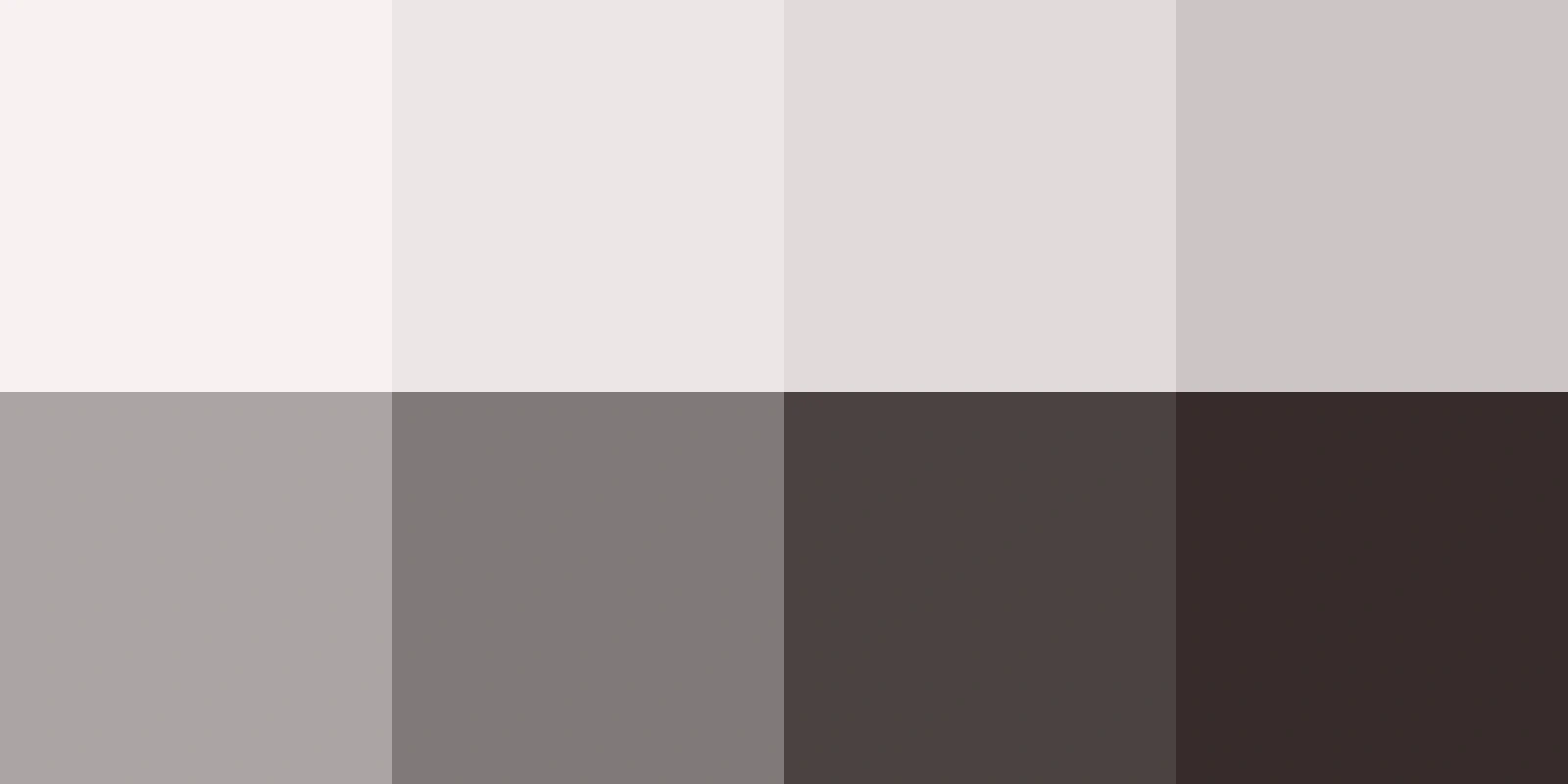
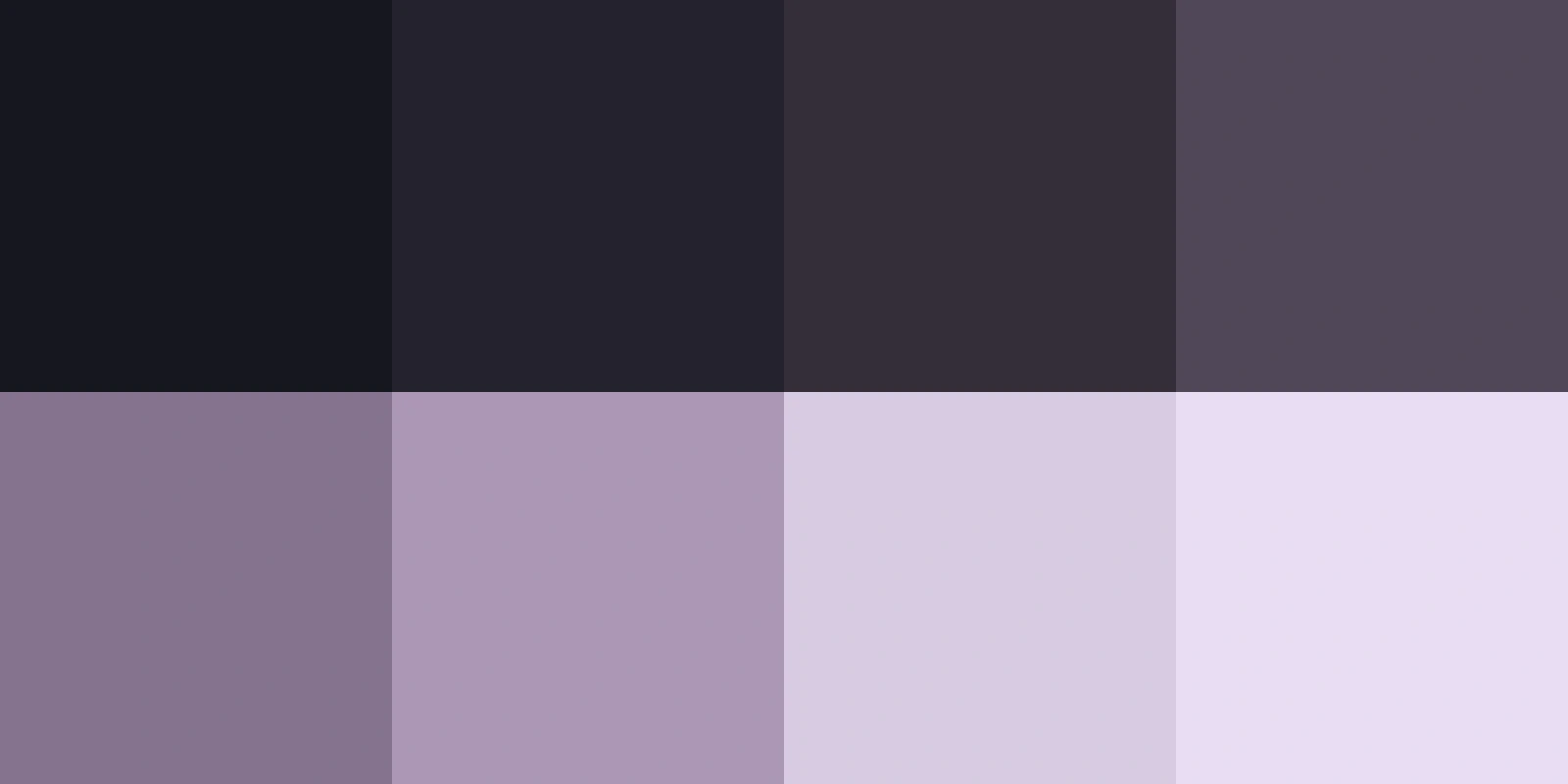
For that, we need to move beyond using just UIUserInterfaceStyle as the source of truth for how we style our app.
Using custom traits in UITraitCollection with UITraitDefinition
What UIUserInterfaceStyle really is is a value that belongs to UITraitCollection, a collection of data that describes how views should look and behave in an app 1.
From iOS 17 onward, the concept of using custom traits to add our own data to UITraitCollection was introduced, and this is an excellent way to provide custom theme data to view controllers and views.
To start, let's create a struct representing our custom trait that conforms to UITraitDefinition:
struct MyAppThemeTrait: UITraitDefinition {
    static let defaultValue = // ???

    static let affectsColorAppearance = true
    static let name = "MyAppThemeTrait"
    static let identifier = "com.myApp.themeTrait"
}
We set affectsColorAppearance to true to let UIKit know that we want trait changes to affect dynamic colors (the whole point of theming). But what should defaultValue be?
Maybe some MyAppTheme enum containing the supported themes:
enum MyAppTheme: Int {
    // Default UIUserInterfaceStyle themes
    case system = 0
    case light = 1
    case dark = 2

    // New themes
    case dawn = 3
    case dusk = 4
}
So then we'd have:
struct MyAppThemeTrait: UITraitDefinition {
    static let defaultValue = MyAppTheme.system

    // ...rest of struct...
}
And this would work just fine going forward. But I already know that I want to support choosing themes for system light and system dark. For example, the following combinations for .system should be possible:
| System Light | System Dark |
|---|---|
| Light | Dark |
| Dawn | Dark |
| Light | Dusk |
| Dawn | Dusk |
and what we have would not support it, because the model cannot differentiate between Light: Dawn + Dark: Dusk and Light: Light + Dark: Dusk for example, and UIKit would not update our views when a user makes this change.
To fix this, let's break up MyAppTheme into two enums:
// The concrete color theme being applied
//
enum MyAppTheme: Hashable {
    case light
    case dark
    case dawn
    case dusk
}

// The theme modes supported by the app:
// 1. A static theme ignoring device's light/dark mode
// 2. A theme dependent on device's light/dark mode
//
enum MyAppThemeMode: Hashable {
    case fixed(MyAppTheme)
    case system(
        light: MyAppTheme,
        dark: MyAppTheme
    )
}
So now our custom trait looks something like this:
struct MyAppThemeTrait: UITraitDefinition {
    static let defaultValue = MyAppThemeMode.system(
        light: MyAppTheme.light,
        dark: MyAppTheme.dark
    )

    static let affectsColorAppearance = true
    static let name = "MyAppThemeTrait"
    static let identifier = "com.myApp.themeTrait"
}
And we can extend UITraitCollection to include this as part of its collection:
extension UITraitCollection {
    var myAppThemeMode: MyAppThemeMode {
        self[MyAppThemeTrait.self]
    }
}
Defining our color tokens
We have a clean way of representing the different themes/modes that the user can select, so now let's move on to defining our color tokens. The usual way of including a light and dark mode variant of a color token in our Assets catalog no longer suffices, because we want more than just two variants (in our case, we want four: light, dark, dawn, dusk) for each token. And that means relying on code to represent them.
Thankfully, UIColor has a dynamic-provider initializer, whose closure receives a complete UITraitCollection. So our provider can read our custom MyAppThemeTrait from the collection and return the appropriate color 2.
So we can extend UIColor to contain all the semantic tokens we want to use, generated via this initializer:
extension UIColor {
    static let foreground = UIColor { traitCollection in ... }
    static let background = UIColor { traitCollection in ... }
    static let secondary = UIColor { traitCollection in ... }

    // ...more tokens...
}
and then the code within those closures looks something like this:
static let foreground = UIColor { traitCollection in
    // Depending on the theme mode from our custom trait,
    // return the appropriate color
    //
    switch traitCollection.myAppThemeMode {
        case .fixed(.light): UIColor(red...)
        case .fixed(.dark): UIColor(red...)
        case .fixed(.dawn): UIColor(red...)
        case .fixed(.dusk): UIColor(red...)
        case .system(let light, let dark):
        ...
    }
}
Yow... this looks kind of messy... let's try cleaning this logic up and moving the color definitions elsewhere, maybe in some MyAppPalette struct:
struct MyAppPalette {
    let foreground: UIColor
    let secondary: UIColor
    let background: UIColor

    // ...more tokens...
}

// Extension containing the colors for
// each theme and semantic token
//
extension MyAppPalette {
    static let light = MyAppPalette(
        foreground: UIColor(red...),
        secondary: UIColor(red...),
        background: UIColor(red...)
    )

    static let dark = MyAppPalette(...)
    static let dawn = MyAppPalette(...)
    static let dusk = MyAppPalette(...)
}
And let's also define a new resolvedTheme variable on UITraitCollection so that we have a convenient access point to the concrete theme to apply:
extension UITraitCollection {
    var myAppThemeMode: MyAppThemeMode {
        self[MyAppThemeTrait.self]
    }

    // Resolve the concrete theme e.g. light, dark, dawn, dusk
    // based on the currently selected theme *mode*, e.g.
    // system light: dawn resolves to .dawn
    //
    var resolvedTheme: MyAppTheme {
        myAppThemeMode.resolvedTheme(for: userInterfaceStyle)
    }
}

// ...and in MyAppThemeMode:

extension MyAppThemeMode: Hashable {
    func resolvedTheme(
        for interfaceStyle: UIUserInterfaceStyle
    ) -> MyAppTheme {
        switch self {
        case .fixed(let theme):
            theme
        case .system(let light, let dark):
            interfaceStyle == .dark ? dark : light
        }
    }
}

// ...and in MyAppTheme:

extension MyAppTheme {
    // Depending on the theme, return
    // the right MyAppPalette containing
    // the semantic tokens
    //
    var palette: MyAppPalette {
        switch self {
        case .light: MyAppPalette.light
        case .dark: MyAppPalette.dark
        case .dawn: MyAppPalette.dawn
        case .dusk: MyAppPalette.dusk
        }
    }
}
So now, our extension on UIColor looks like:
extension UIColor {
    static let foreground = UIColor { traitCollection in
        traitCollection.resolvedTheme.palette.foreground
    }
    static let background = UIColor { traitCollection in
        traitCollection.resolvedTheme.palette.background
    }
    static let secondary = UIColor { traitCollection in
        traitCollection.resolvedTheme.palette.secondary
    }

    // ...more tokens...
}
Then, we can start using these colors like we would normally:
view.backgroundColor = UIColor.backgroundexcept that they now respect the theme mode set by the user, and resolve to the appropriate color corresponding to that mode.
Respecting UIUserInterfaceStyle
Even though we're no longer relying on UIUserInterfaceStyle to theme our app, we still need to respect it because it's responsible for letting UIKit know whether native elements like the status bar, alerts, keyboard etc. should use their light or dark appearance.
In our case, we want our .dawn theme to be paired with the light appearance, and .dusk to be paired with the dark appearance.
We can extend MyAppTheme to do just that:
enum MyAppTheme {
    case light
    case dark
    case dawn
    case dusk

    // ...other methods...

    // Pair each theme with its corresponding
    // `UIUserInterfaceStyle`
    //
    var interfaceStyle: UIUserInterfaceStyle {
        switch self {
        case .light, .dawn:
            UIUserInterfaceStyle.light
        case .dark, .dusk:
            UIUserInterfaceStyle.dark
        }
    }
}
and then, we also need to let MyAppThemeMode know of these new associations:
enum MyAppThemeMode: Hashable {
    case fixed(MyAppTheme)
    case system(
        light: MyAppTheme,
        dark: MyAppTheme
    )

    // ...other methods...

    var interfaceStyle: UIUserInterfaceStyle {
        switch self {
        case .fixed(let theme):
            theme.interfaceStyle
        case .system:
            UIUserInterfaceStyle.unspecified
        }
    }
}
Then, still in MyAppThemeMode, we can create a new method that applies both parts (the color palette and the UIUserInterfaceStyle) of a theme together:
extension MyAppThemeMode {
    // Apply both color palette + UIUserInterfaceStyle
    // of a theme together
    //
    func apply(to window: UIWindow) {
        // Apply UIUserInterfaceStyle corresponding to selected theme
        window.overrideUserInterfaceStyle = interfaceStyle

        // Apply trait override to window such that it propagates
        // through the view hierarchy
        window.traitOverrides[MyAppThemeTrait.self] = self
    }
}
Applying our custom themes
Finally, with all the pieces in place, in SceneDelegate we have:
final class SceneDelegate: UIResponder, UIWindowSceneDelegate {
    var window: UIWindow?

    func scene(
        _ scene: UIScene,
        willConnectTo session: UISceneSession,
        options connectionOptions: UIScene.ConnectionOptions
    ) {
        guard let windowScene = (scene as? UIWindowScene)
        else { return }

        let window = UIWindow(windowScene: windowScene)
        self.window = window
        window.makeKeyAndVisible()

        // ...other setup details...

        // APPLY THE THEME!
        MyAppThemePreferences.selectedMode.apply(to: window)
    }
}
where MyAppThemePreferences is a simple wrapper over UserDefaults 3, and .selectedMode simply queries for the theme mode that a user has set.
And when we want to change the selected theme while the app is running, we can call:
func selectTheme(_ mode: MyAppThemeMode) {
    MyAppThemePreferences.selectedMode = mode
    mode.apply(to: window)
}

// e.g. in some settings view, we can do
//
selectTheme(MyAppThemeMode.system(light: .dawn, dark: .dusk))
Resolving CGColor with theme changes
One more thing we have to look out for is applications of CGColor. With resolved CGColors, their properties do not update automatically like UIColors, and this is especially relevant for borders and gradients that use CGColor values.
In order to dynamically update them when the theme changes, we need to register for trait changes and explicitly resolve the colors again, like so:
final class SomeView: UIView {
    override init(frame: CGRect) {
        super.init(frame: frame)

        // Apply colors to view for the first time
        //
        updateColors()

        // Listen for changes to MyAppThemeTrait
        // so this view knows to update the resolved
        // CGColors of views that use them
        //
        registerForTraitChanges(
            [UITraitUserInterfaceStyle.self, MyAppThemeTrait.self]
        ) { (self: Self, _) in
            updateColors()
        }
    }

    func updateColors() {
        layer.borderColor = UIColor.foreground
            .resolvedColor(with: traitCollection)
            .cgColor
    }
}
Adding more themes
If in the future we want to add more themes, we can define them in MyAppTheme:
enum MyAppTheme: Hashable {
    case light
    case dark
    case dawn
    case dusk

    // New theme
    case sunset

    // Update the palette corresponding
    // to the new theme
    //
    var palette: MyAppPalette {
        switch self {
        case .light: MyAppPalette.light
        case .dark: MyAppPalette.dark
        case .dawn: MyAppPalette.dawn
        case .dusk: MyAppPalette.dusk

        // New palette
        case .sunset: MyAppPalette.sunset
        }
    }

    // Update the UIUserInterfaceStyle corresponding
    // to the new theme
    //
    var interfaceStyle: UIUserInterfaceStyle {
        switch self {
        case .light, .dawn, .sunset:
            UIUserInterfaceStyle.light
        case .dark, .dusk:
            UIUserInterfaceStyle.dark
        }
    }
}
and extend MyAppPalette with this new sunset palette of UIColors:
extension MyAppPalette {
    static let light = MyAppPalette(...)
    static let dark = MyAppPalette(...)
    static let dawn = MyAppPalette(...)
    static let dusk = MyAppPalette(...)

    // New palette of colors for sunset theme
    static let sunset = MyAppPalette(
        foreground: UIColor(red...),
        secondary: UIColor(red...),
        background: UIColor(red...)
    )
}
Then, we can expose it as a new theme option in some settings page, and that's it!
Diagram
As a parting gift I leave you with a diagram illustrating the general flow of the custom theming system:
flowchart TD
    A["App launches or user selects a theme"] --> B["Read <code>MyAppThemeMode</code>"]
    B --> C["Apply mode to <code>UIWindow</code>"]

    C --> D["Set <code>UIUserInterfaceStyle</code>"]
    C --> E["Set <code>MyAppThemeTrait</code>"]

    D --> F["UIKit elements use<br/>Light or Dark appearance"]
    E --> G["Dynamic <code>UIColor</code>s use<br/>the selected palette"]

    F --> H["App updates with new appearance"]
G --> HOther values include horizontalSizeClass and displayScale to let views know how to size and render themselves, for example.
This is basically the magic sauce that makes the whole operation work lol. We want to be able to use a color token like UIColor.background that automatically resolves the color based on a user-selected theme without worrying about the underlying logic and to keep call sites clean.
Implementation omitted for brevity, but here's a gist of what that could look like. Make sure both MyAppThemeMode and MyAppTheme conform to Codable to make them compatible with UserDefaults.